Case Study: Improving the Shopping Experience for SanDisk Professional Hard Drives through UI/UX/Product Design.
Design Role: UX Design Lead, Visual Design, Branding and identity, Iconography
Tools used: Adobe XD, Photoshop, Illustrator
Deliverables: Personas, User Journey, User Flows, Wireframes, Prototype, User Testing, Visual Design
Challenge:
Consumers are confused by multiple types of hard drives and storage devices SanDisk provides because they all do basically the same thing.
Solution:
Provide shoppers with a clearly organized way to understand the difference in similar product types so they can complete their purchase.
Defining the Problem
When I first came to Western Digital I was quite confused by all the hard drives and SSDs they offer. If employees cannot understand, how do we expect the consumer to know the difference between hard drives? I identified the store as a key area where we can educate and improve the shopping experience for consumers.
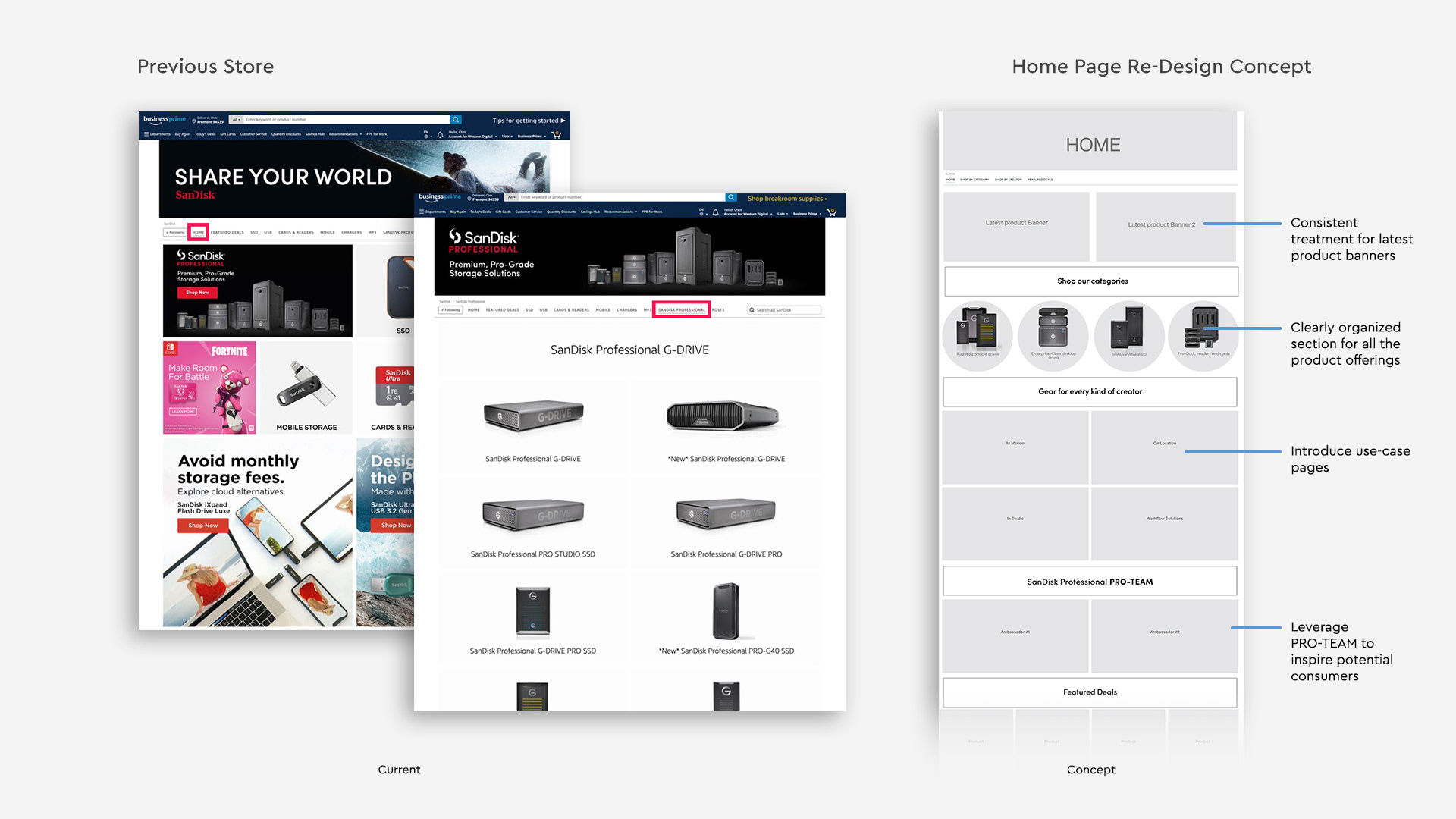
Evaluating the previous store
The store consisted of promotional banners with mixed product categories. On product pages, like "SanDisk Professional," the Home page displayed cascading products with unclear messaging, causing consumer confusion due to the jumbled presentation.
Evaluate Current Communications
Currently, you can get to the SanDisk Professional store within the SanDisk Brand Store, or via paid media that links directly to the store.
Originally, on a SanDisk Professional product, you click [visit the SanDisk Professional store], which takes you to the SanDisk store, and yet requires another click to see all SanDisk Professional products.
Some products don’t even appear there, it just searches for SanDisk Professional, where competitor products also appear. The current structure doesn't make sense for professional products. We don't think the audience for SanDisk and SanDisk PRO overlap and believe the stores should be completely separate.

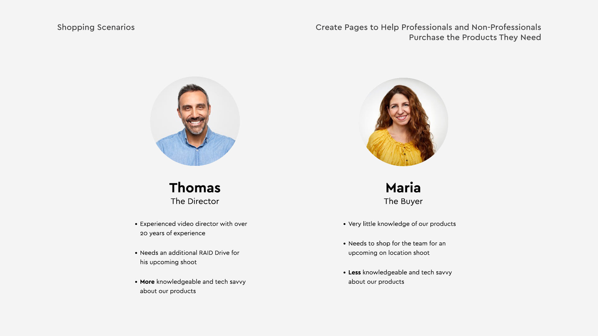
User Personas
Through research we discovered the audience varies from the highly techincal to non-technical. This store needs to work for both types of audiences.
User Flows and Wireframes
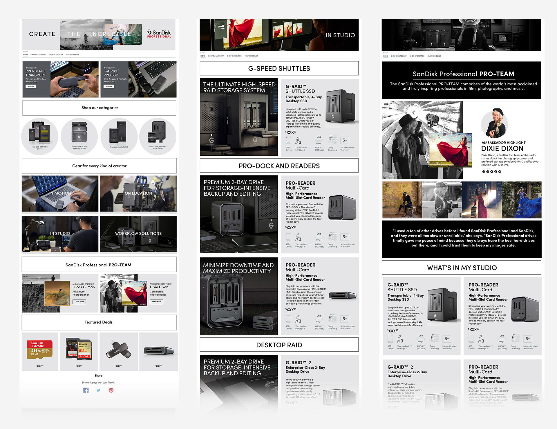
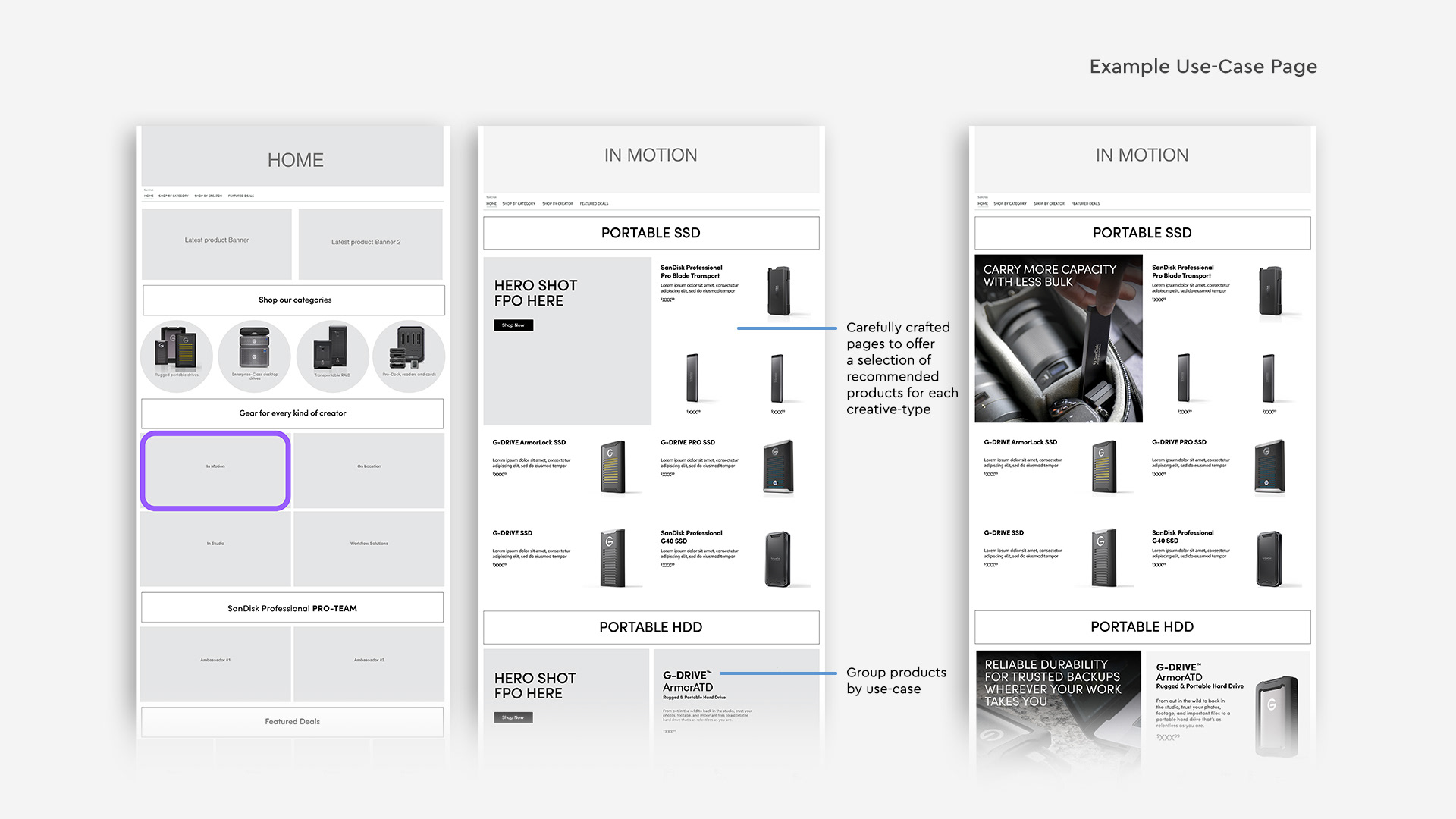
Based on our understanding of user personas, we redesigned the store to work for both highly technical and non-techinal audiences. The home page was re-organized to keep categories separate from promotional imagery. We also added "use-case" shopping experiences.
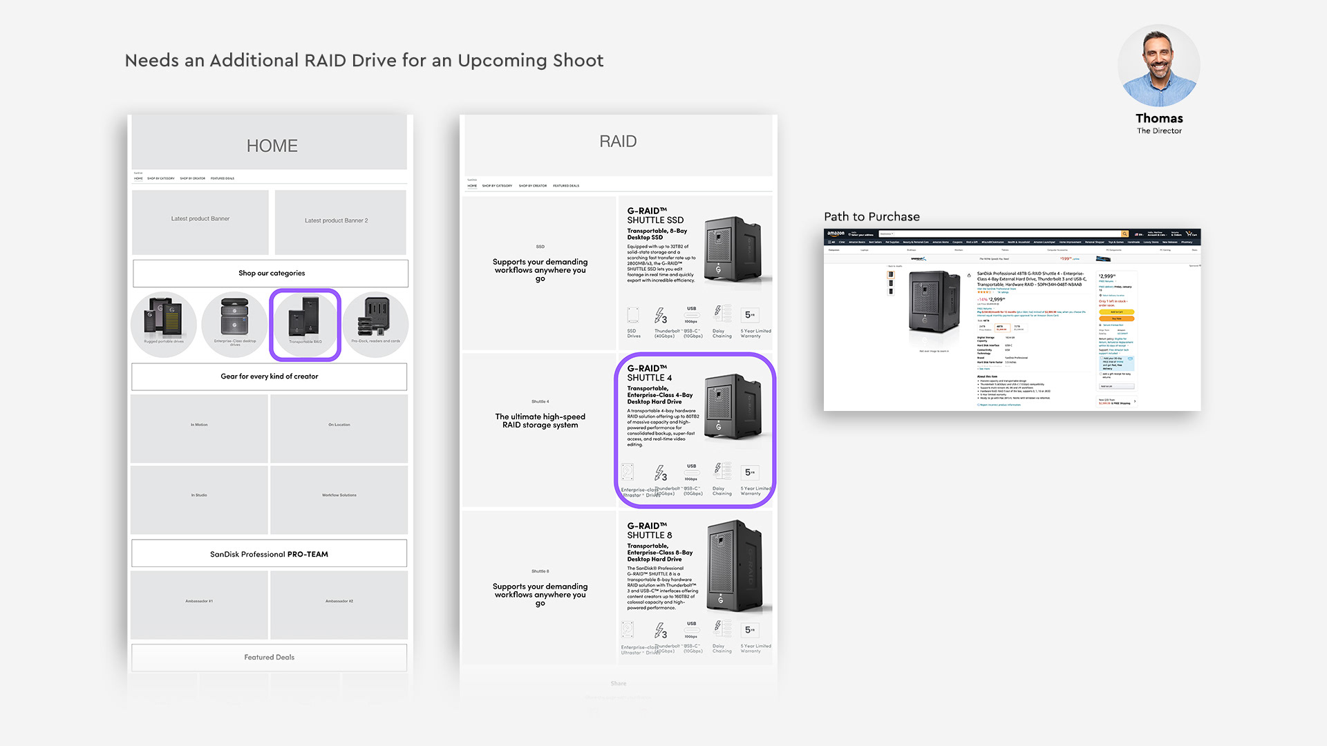
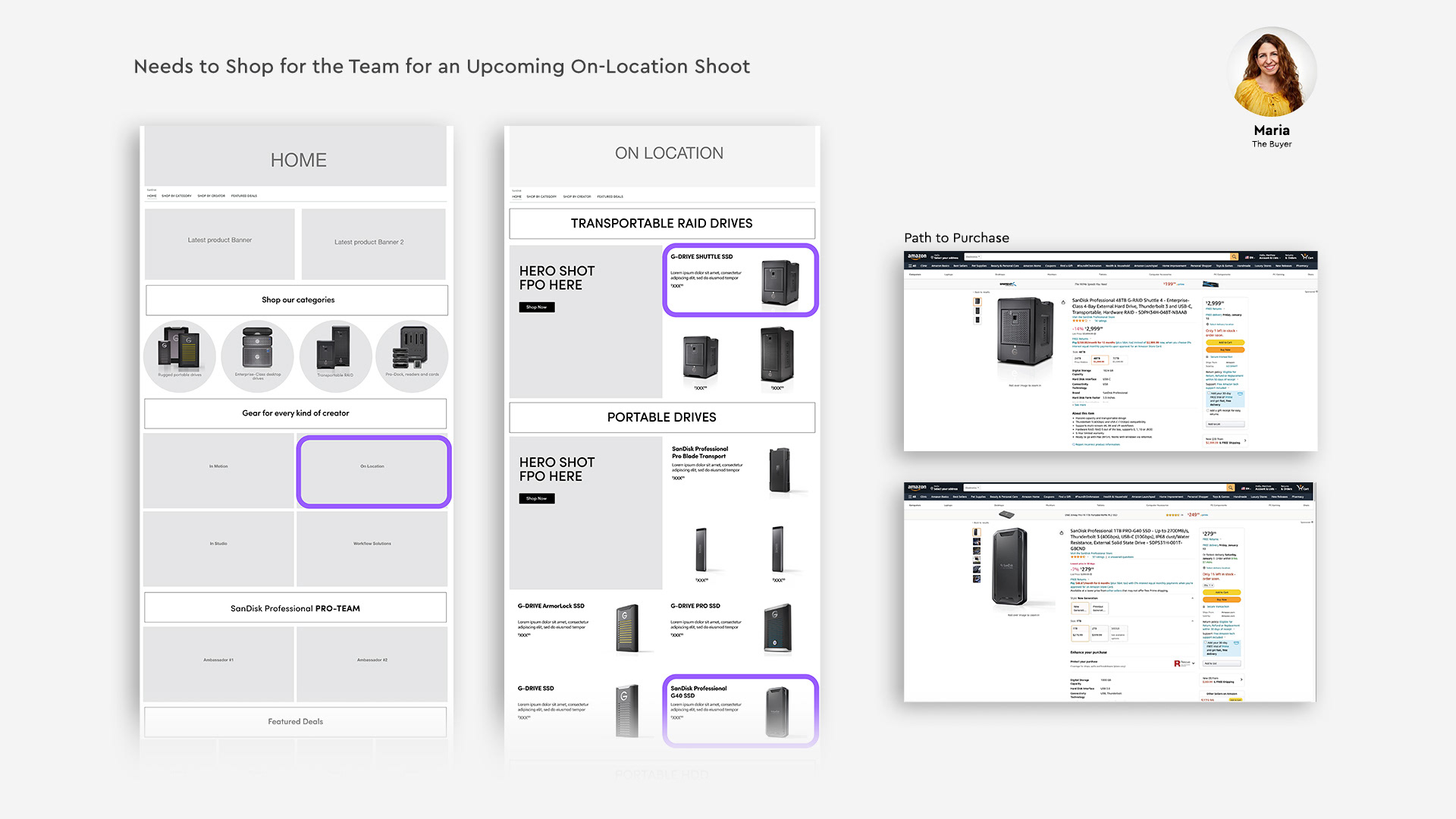
Use-case shopping experiences are tailored for specific audiences: photographers on location, in-studio, photography workflow solutions, and in-motion. These pages would have tailored products specific to the use-case to help the less tech savvy audience.
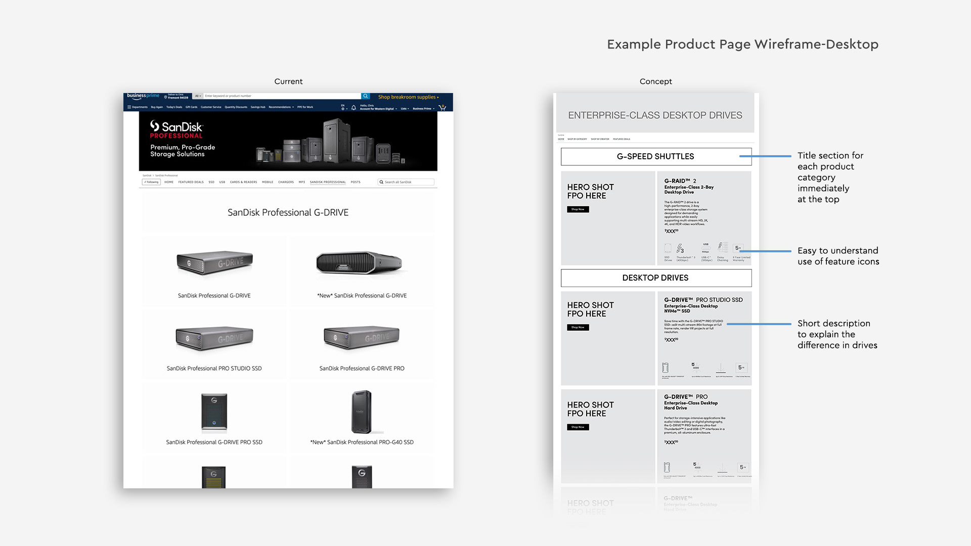
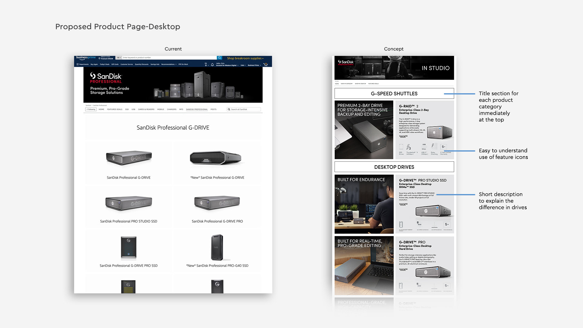
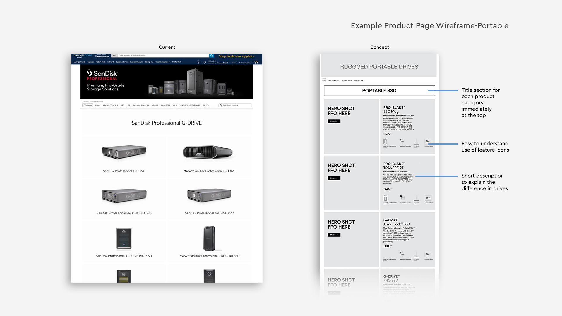
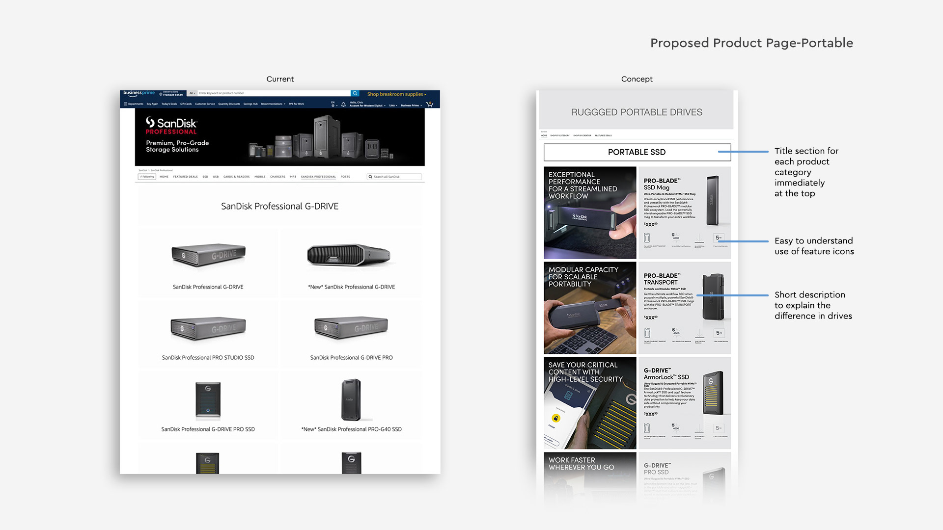
Product pages became much more informed with a clearly organized title section for each product category at the top with easy to understand differences.
Product Pages
The way it is currently organized, it puts the responsibility on the consumer to go out and do research. They’d have to click on every single product to understand what they are and what they do.
Limiting to a few products in each category allows us to do more to convert the sale. Lifestyle imagery and icons to quickly show the features with a short description to let them know why they should click to buy this product.
Use-Case Pages
When we perform user testing wireframes with other colleagues throughout the company we start to understand how people approach products differently. This scenario enables us to tailor our product offering to specific use cases.
It’s still important to have a product description using the Amazon tool, but we can help organize products in a way that’s going to make sense to that buyer's shopping scenarios.
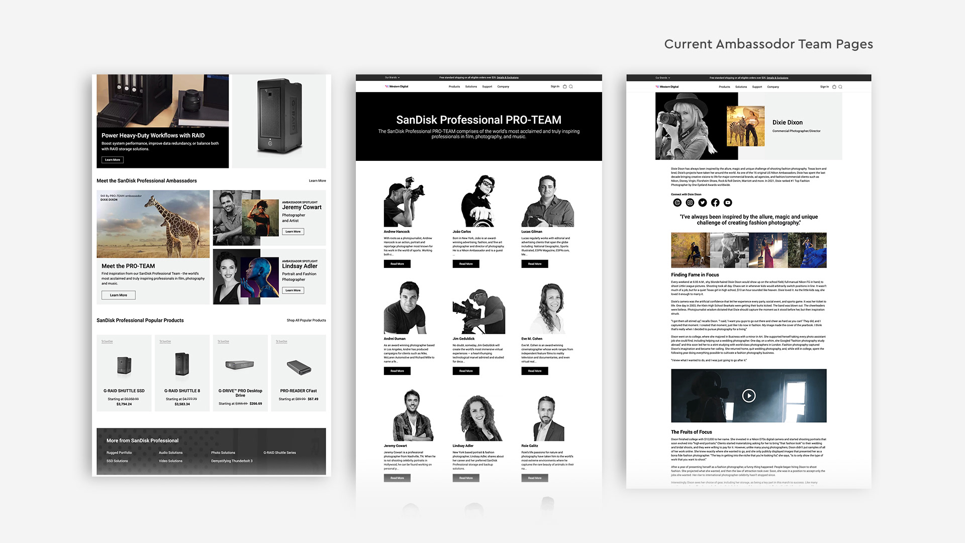
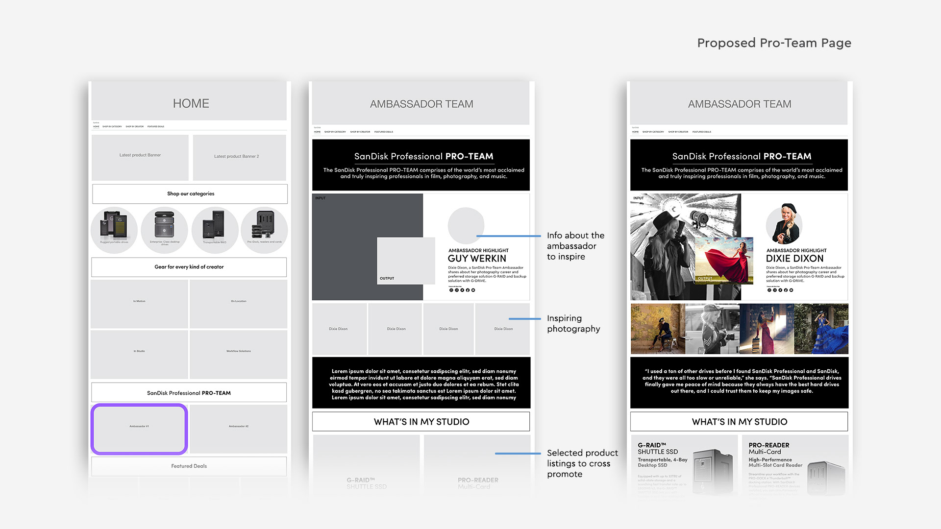
PRO-TEAM Pages
Currently, our website features an extensive list of Ambassador members with lengthy bios and descriptions, complemented by inspirational images from the photographer. However, we believe that a Pro-Team page would better serve our purpose of inspiring our target audience and driving sales.
By showcasing only a select few Pro-Team members and their interviews discussing "what's in my bag" and the ideal gear for backing up, we aim to create a stronger connection with our audience and encourage more sales. This is similar to the Nike approach, where consumers are motivated to "be like Dixie" and are inspired to make a purchase that aligns with their aspirations.
Shopping Scenarios
The way we approached this design exploration was by using shopping scenarios, putting ourselves in the shoes of the audience. We’ve got Thomas, an experienced director who knows exactly what he needs.
Then we came up with Maria, thinking of a buyer at an Ad agency or TV company. She may not know exactly how to use the products, but is familiar with what is needed for an upcoming shoot.
We approached this as if SanDisk Professional was its own store. Because these are premium products, we felt that it needed to be separate from the rest of current SanDisk Brand Store which has a broader audience.
Action Items/Key Takeaways
Redesigned SanDisk and SanDisk Professional Brand stores from initial strategy, concept, wireframes, prototype, user testing and visual design. This rebrand resulted in increased click-through conversion rate and reduced consumer confusion for multiple variations of memory cards and hard drives. The key take-away is that we can generate on Amazon alone over $1M additional sales per quarter.