Case Study: How Western Digital Designers Forecast Color Trends.
Design Role: Lead Designer, Creative Direction, Product Design, Trends Research, Specialty Packaging, Illustrations, Presentations, Pitch Work, Project Management
Tools used: Adobe Photoshop, Illustrator, InDesign, Worfront, PowerPoint, WGSN
Deliverables: Personas, Concepting, Strategy, Trends Research, Brochures, Pitch Work, Customized Packaging, Illustrations, In-Store displays and Web and Visual Design
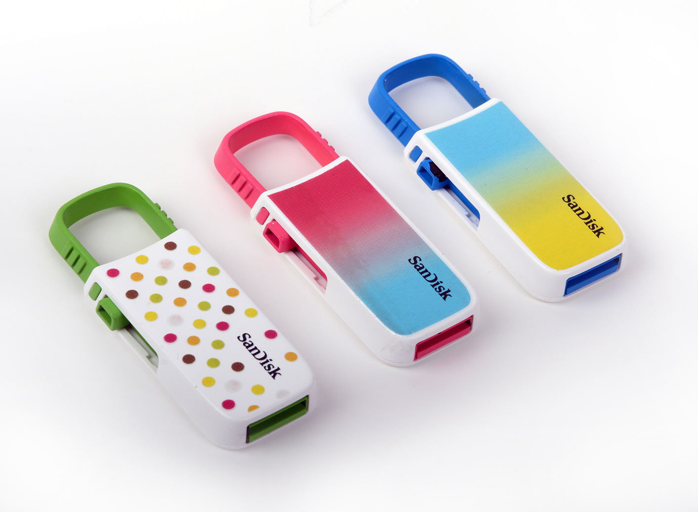
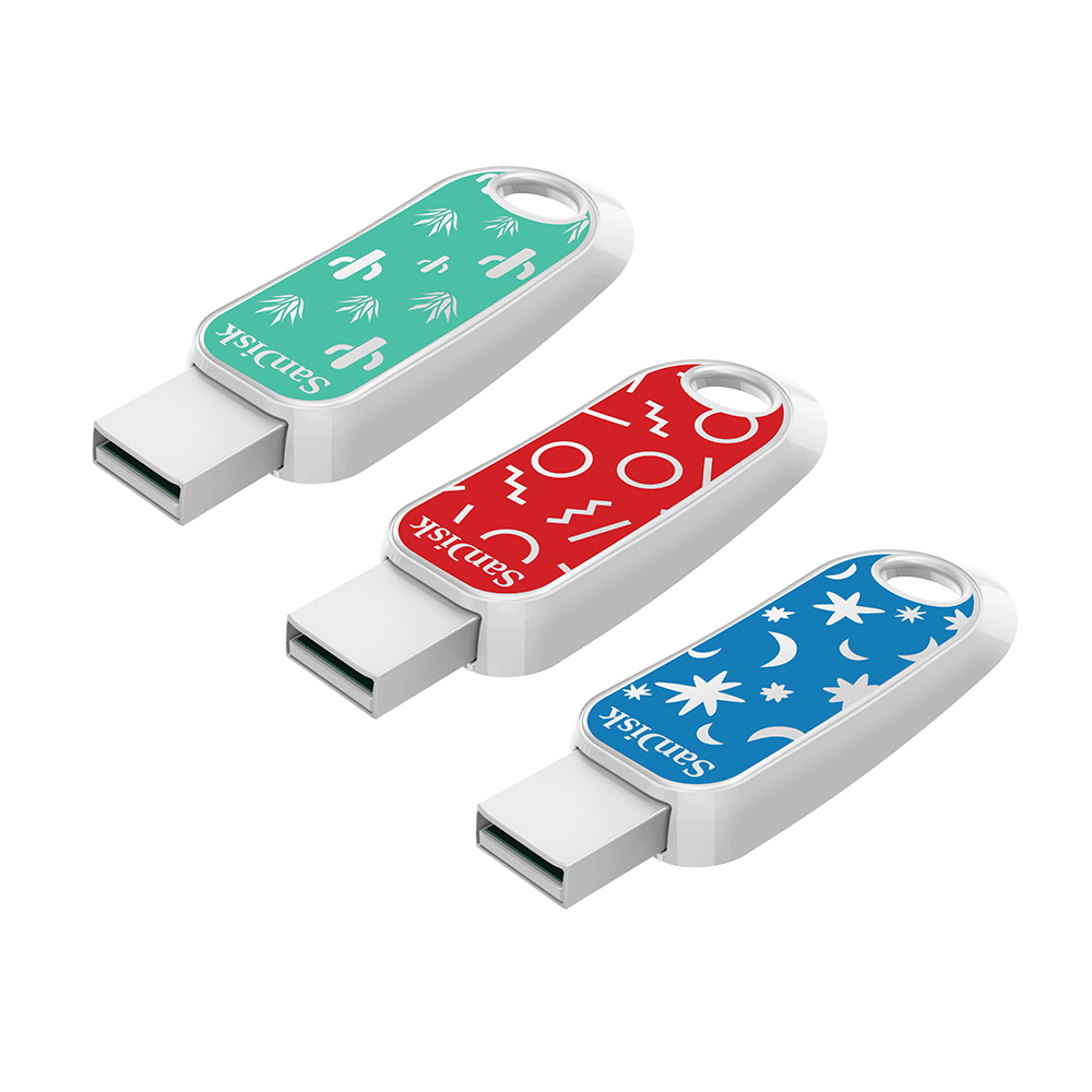
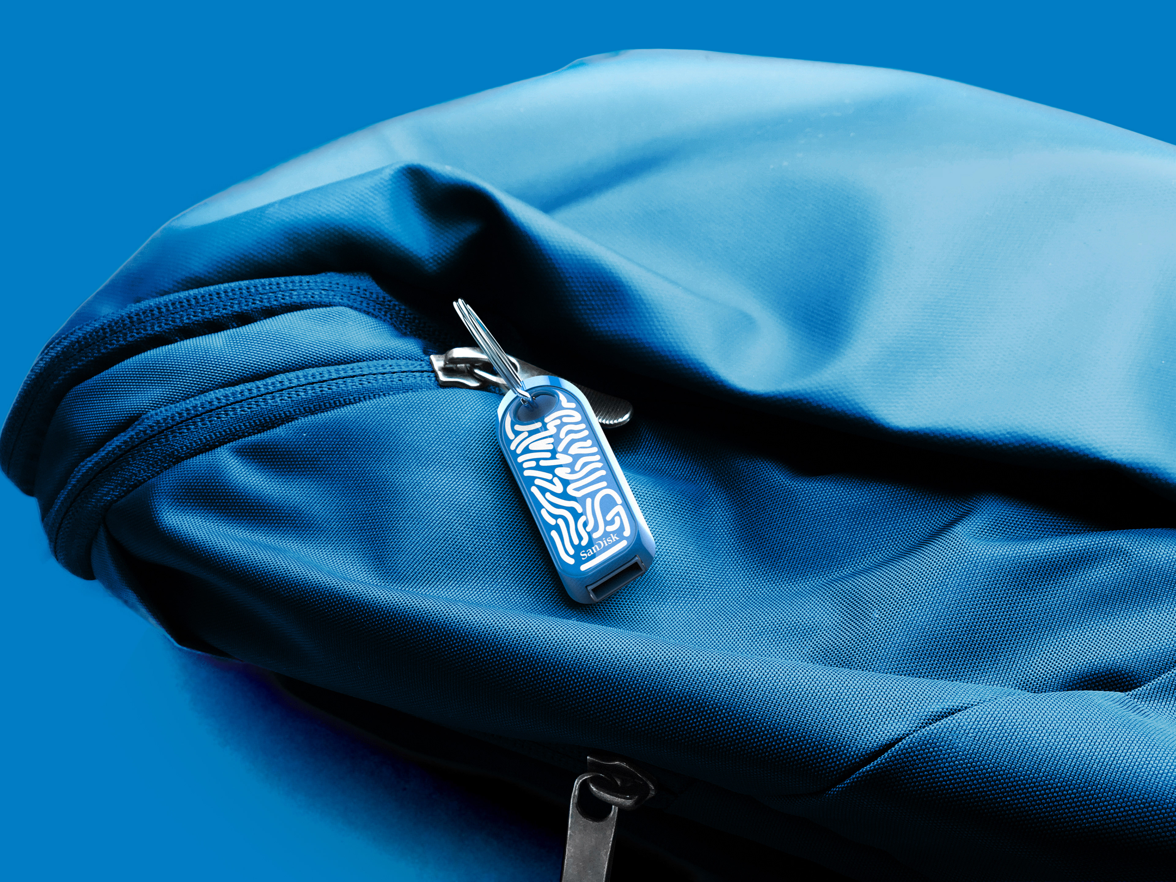
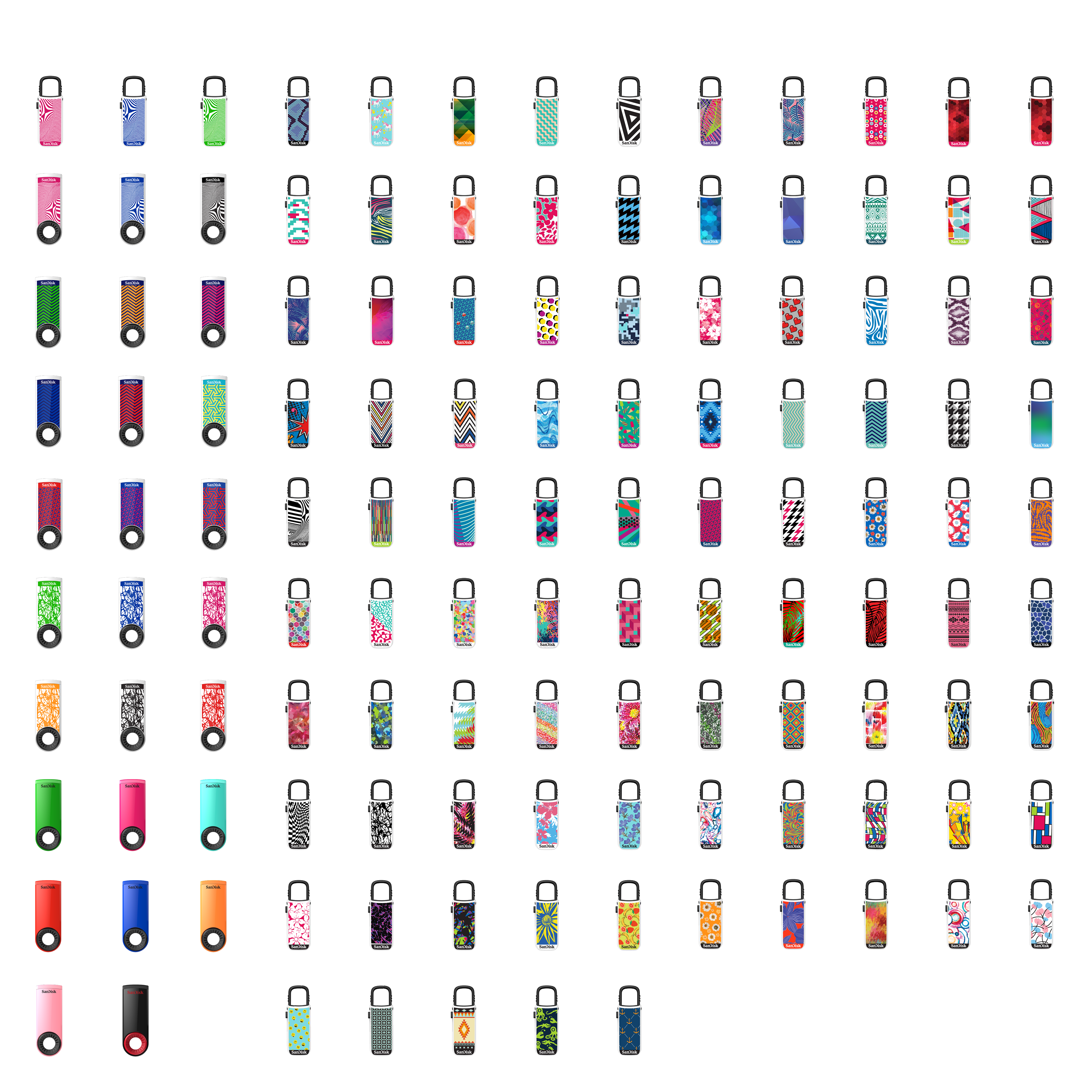
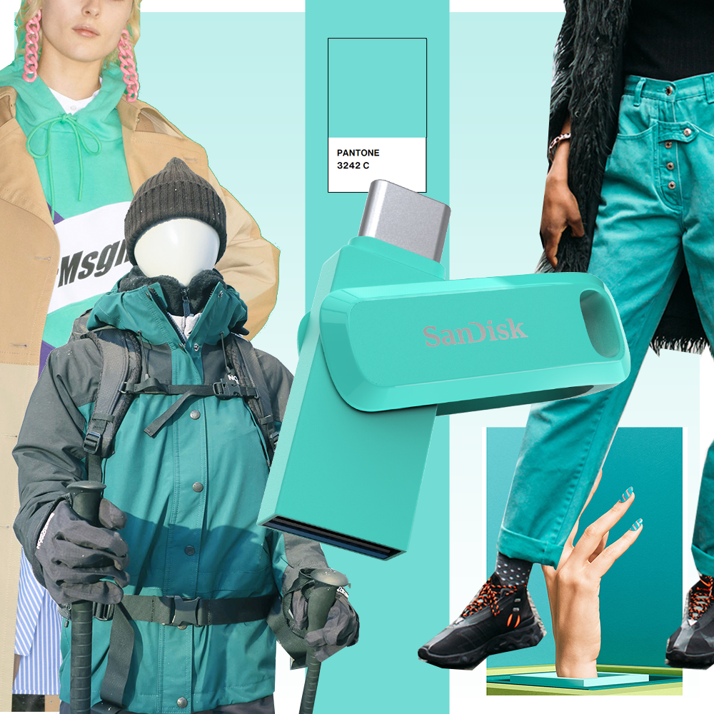
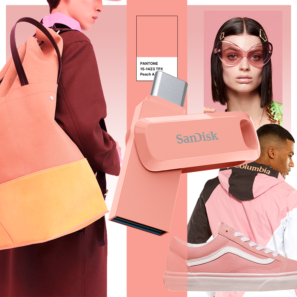
A number of Western Digital’s products come in an assortment of colors, from the bright hues of the SanDisk Ultra Dual Drive Go USB to the jewel tones of WD’s My Passport SSD.
The products’ colors are expressions of individuality and personality, offering to appeal to the diverse range of customers’ tastes and preferences. In a world full of limitless color possibilities, it is the job of the Product Design team to curate the colors that make their way into the company’s products.
To arrive at the color you see today, the team carries out an extensive selection process in which each color is carefully chosen through research and planning.
I lead the process and development in-house for predicting trends in colors and style. Our team conducts this process yearly so that we stay up to date on the latest trends and address business needs globally and regionally. The design team begins this process by combing through a broad range of research sources for inspiration.
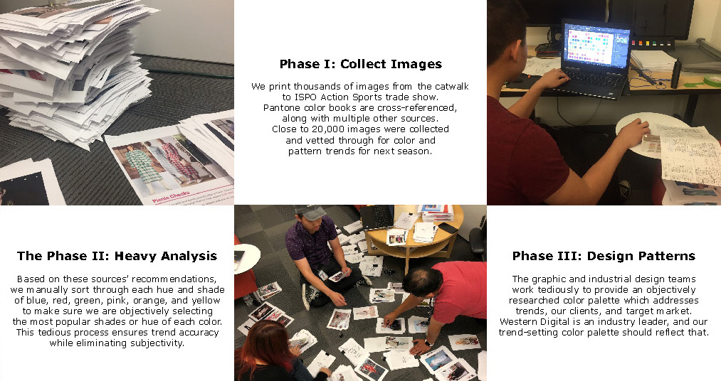
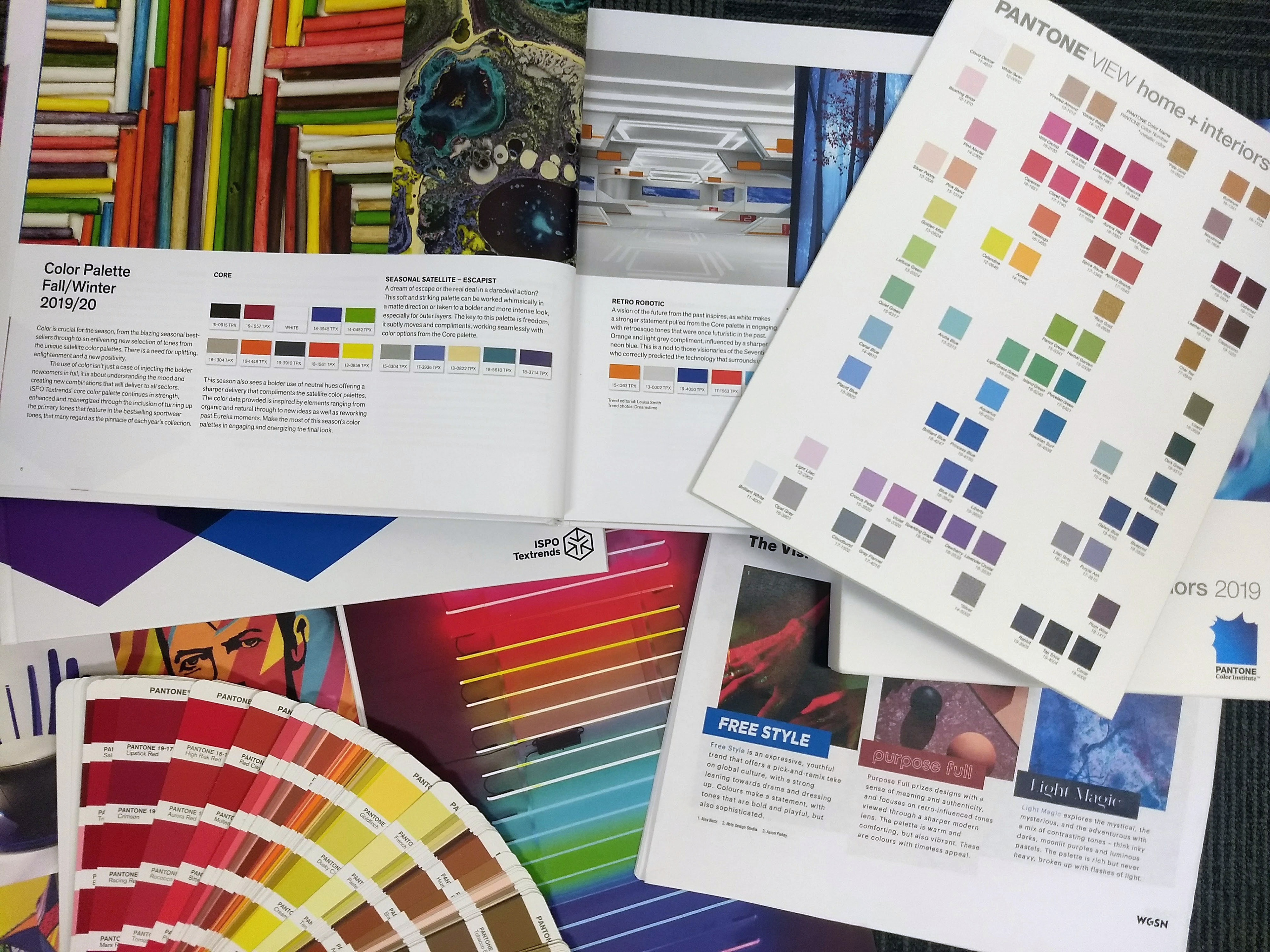
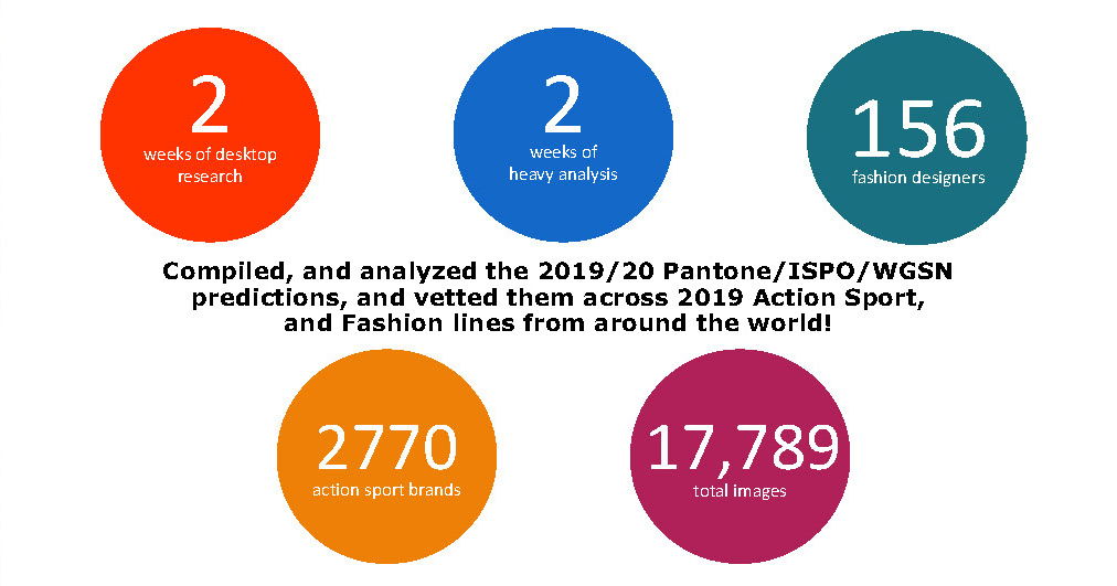
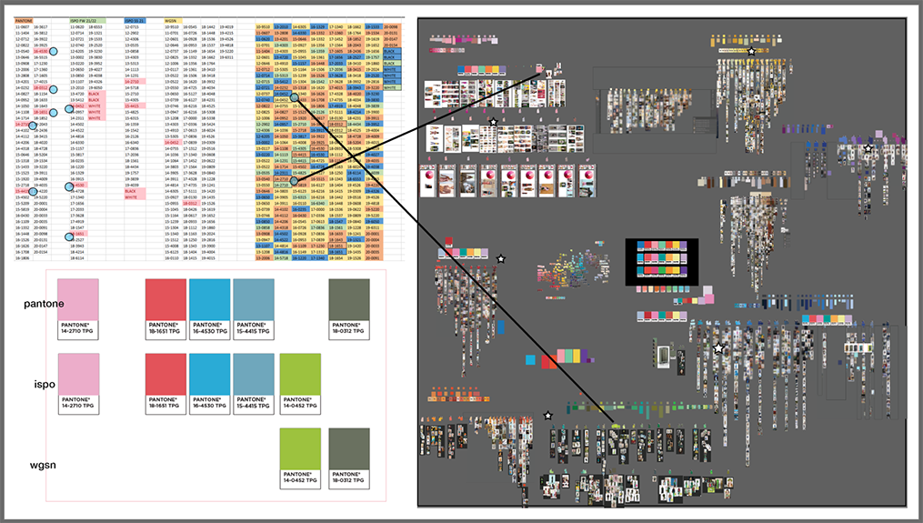
Together we collect thousands of images from fashion shows, from sport brands—anything on the market that we see is going to be influential. I also, led research with the help from the top three trend research companies: Pantone, which specializes in color, WGSN for global trend research across all categories, and ISPO for action sports.
The images our team assembles represent global trends and can include photos of items such as fashion clothing, apparel, sporting goods like snowboards and outdoor gear.
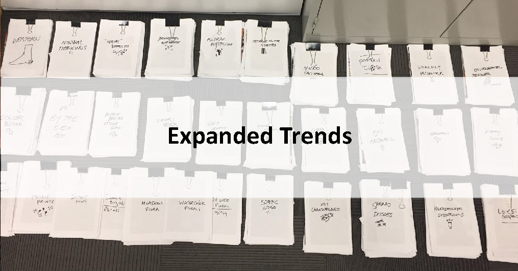
We can make our predictions based on these images because these are items that won’t be available until the next year. Equipped with this library of visual inspiration, the team analyzes and aggregates the images into color and pattern families.
Previously [Pre-Covid], we performed this analysis step manually, printing out and sorting through thousands of images by hand. Organizing the photos with the design team "into stacks" of images on the office floor. It’s not only a qualitative research process, but also a quantitative one.
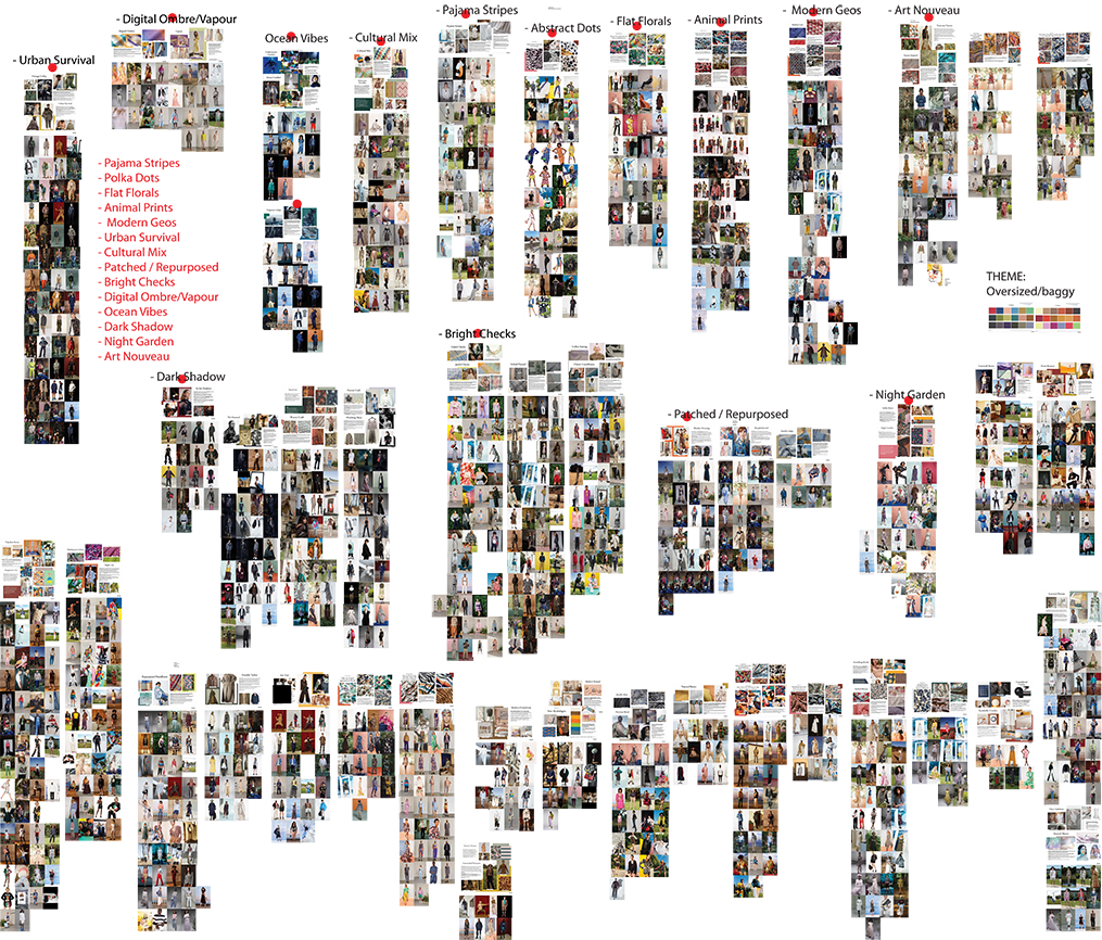
Today, the analysis step takes a different shape. As we began to [work from home], it became necessary to transition our workflow. Now, we digitally sift through the images manually, arranging them into digital color boards.
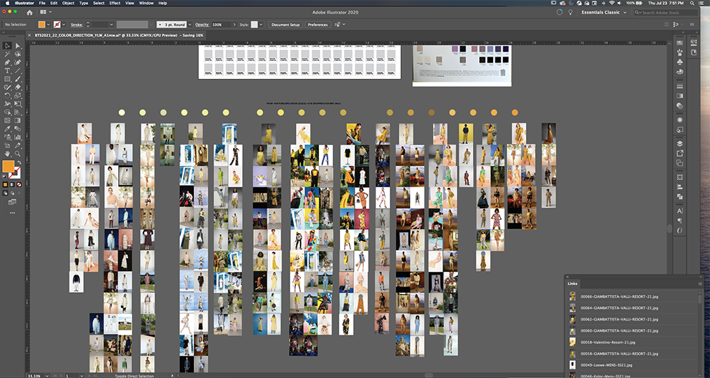


For each color board, designers distinguish between subtle variations, grouping the images into their distinct color category, tracking the trends that emerge collectively.
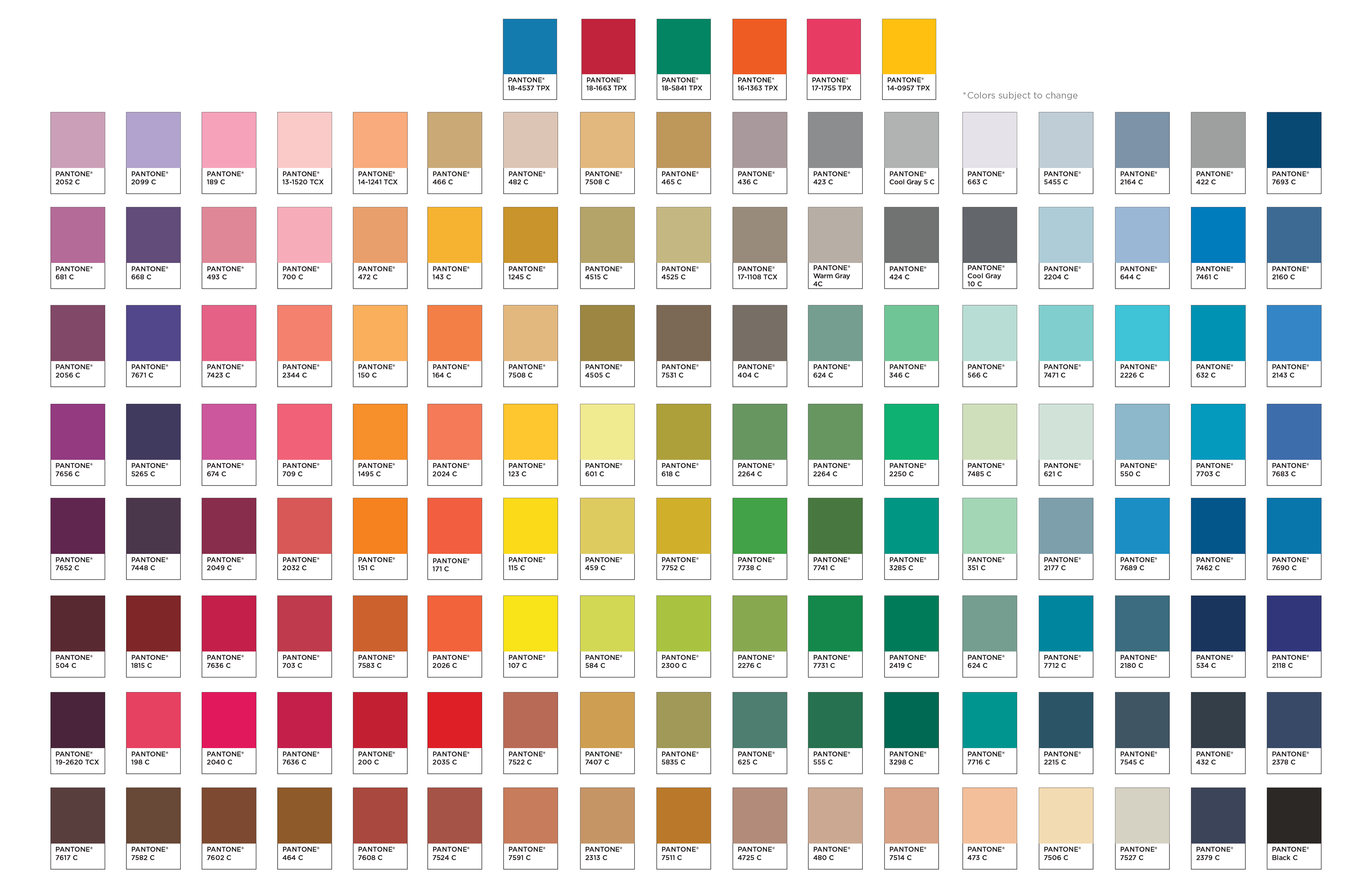
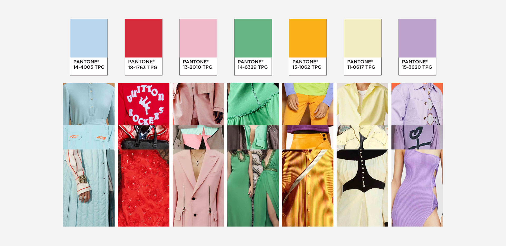
The team will cross-reference the color trends that they observe with the libraries available from the research trend companies, which also provide color codes based on values such as a color’s hue, saturation, and intensity.
It gives us a numerical way to look at the color families. For example, there can be two blues that appear similar due to how they’re perceived or displayed on our screens, and we’re able to validate if they’re duplicates.
This work culminates in the colors we select for our products. We try to keep [the process] as objective as possible. This ensures that the colors we’re proposing will be relevant in the market.
For the team, color is an important element to any given product’s overall look and feel as it can add another dimension to the design language.
Back to school season is a time when the team often puts our predictions into practice. For some products during this offering period, color functions as a focal point. Brighter, more saturated colors can express a fun and playful feeling.
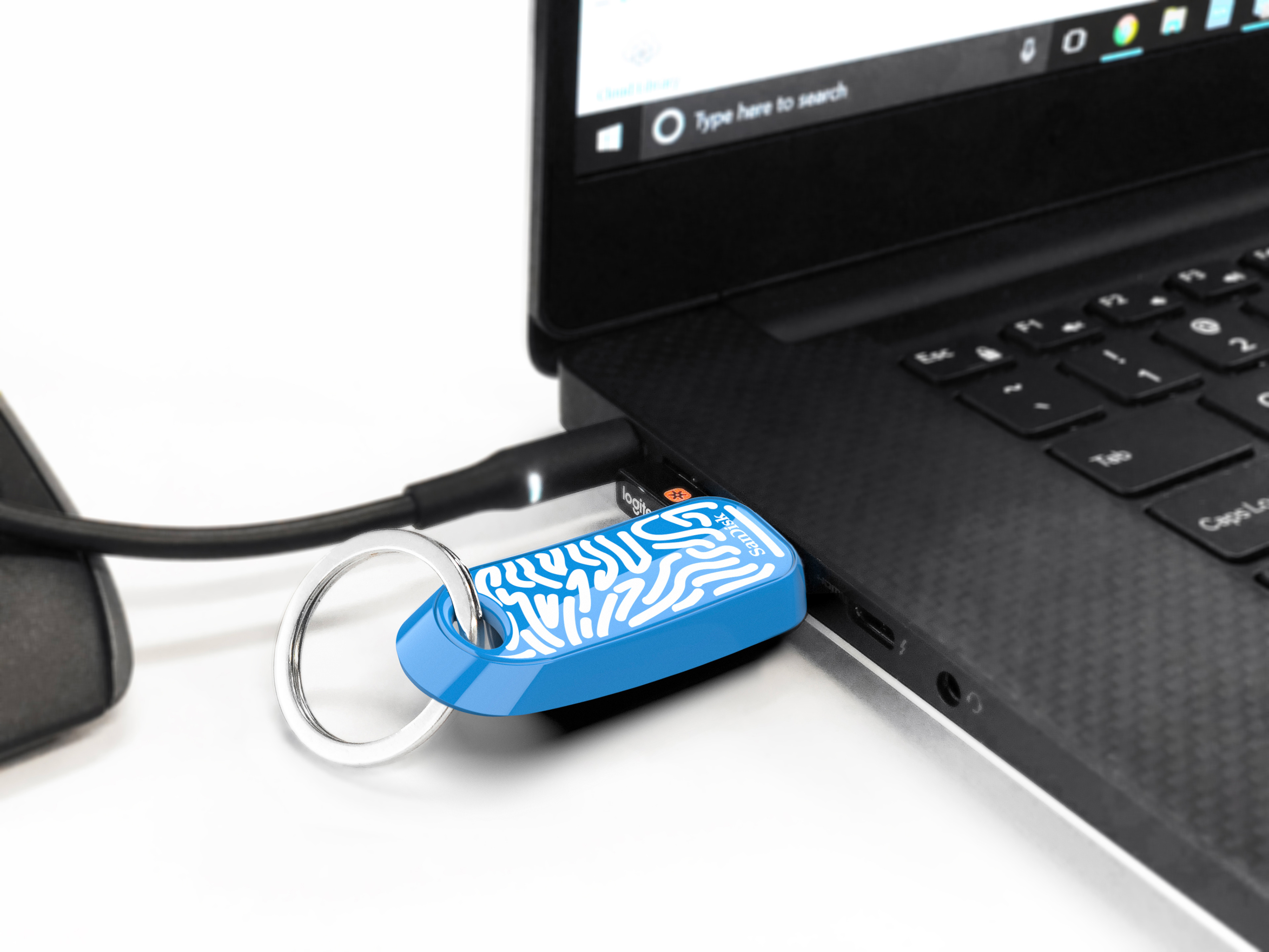
In contrast, for a product like the iXpand Flash Drive Luxe from SanDisk, the design is focused on highlighting the material choice for the drive. As a result, subdued shades are chosen to showcase the metallic exterior. The colors evoke the luxurious, premium qualities of the drive.
On occasion, the team must balance our predictions with practical concerns. We need to consider the materials that we’re working on. For instance, a color that looks good on fabric may not transfer to plastic.
Once we finalize the color selections, together we collaborate with the engineering teams to bring our vision to life. We work closely with our engineers to ensure that the color on the product matches [the intended design.
The team’s color prediction process is not only a tool for selecting a particular color, but it is also a benchmark for the team, a means to continuously assess our work and knowledge of the industry.
As designers, we need to be current on trends. It’s important for us to propose colors and styles that are going to be in the market at the time of launch. We don’t want to launch something that is completely off and doesn’t match with other products.
Sometimes, we’ll receive specific requests from different teams or regions. The process that we developed helps shorten the path to production because we’re prepared. The process helps us be proactive rather than reactive, and it affirms where we should be moving forward in the future.
The research team finds the process to be a satisfying experience, especially when our predictions come true. We can often validate our predictions with the products that we see are launching this year. We can see all these trends—it’s impossible not to notice that our predictions are on point and correct.
Color imbues vibrancy into the world around us. It can capture a moment in time, reflecting current tastes and trends. The Product Design team selects each color with intent, readying ourselves and Western Digital with insight into where the trends are headed in the future.